News and Arche•bytes
Welcome to our home away from home.
While we continue to prepare for the official launch of archetypedesignstudio[dot]com, please feel free to view some of our featured projects either by scrolling down or via the directory (to your right).
You are also invited to glimpse into the depths of a designer's musings at ARCHE•BLogGER, a visual exploration inside a creative mind.
December 10, 2007
Valley of the Kings/Valley of the Queens Original Website Soundtrack
VALLEYOFTHEKINGS.COM and VALLEYOFTHEQUEENS.COM are the official dedicated online stores of authentic pharaonic apparel. These modern, designer clothing lines are inspired by the art, culture, iconography and spirit of Ancient Egypt, the world's first Nation-State.
The designer brilliantly captures the mystery, power and unparalleled majestic splendor of Ancient Egypt through the client's authentic branding initiative in this custom packaged 8 fold custom double CD eco wallet set. The centerfold for example, shown in more detail in the link next to the client name, was implemented into a poster composed of images from dozens of authentic Ancient Egyptian artifacts to aid in telling the epic story behind the brand.
The CD consistently compliments the Cinematic Poster as well as promote the web site and consequently, the line itself.
©2008 Dagmar Jeffrey. All designs are under their respective copyright. All rights reserved.
AMP logo
 Client: The Association of Music Producers
Website: www.ampnow.com
The client was looking for a simple, clean yet bold statement to represent the union of professionals from the commercial music industry. Nothing is bolder...in a classic sense...than black and white. The look of the mark was also symbolic on a few fronts. For example, placed side by side, black and white is indicative of a union of a kaleidoscope of backgrounds and ideas (here meant to minimalistically reflect the myriad of musical styles coming together under one banner).
The bold "AMP" in a sleek extended face adds strength and presence. In a subtractive color model, black is essentially all the color wavelengths absorbed—here it is also symbolic of the different music houses joining together.
©2008 Dagmar Jeffrey. All designs are under their respective copyright. All rights reserved.
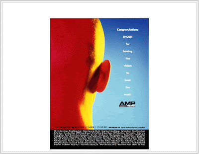
AMP Shoot Ad
Bzztby Berkley
 Client: Personal
One of the forums I frequent held a friendly "create a killer robot" competition on their site. As such, the parameters were pretty flexible...anything pretty much went, so long as it didn't infringe on anyone's creative rights (or any other copyright for that matter). One's "killer" robot didn't necessarily have to be all that deadly either...a PMS day was sufficient enough (although some submissions ended up being just plain cute).
In less than an hour, Bzztby Berkley was born by way of Adobe Illustrator to a proud organic momma. Armed with his "lens flare" ray and "color-COLOR!" power, he has elements that are inspired by a fictitious "what if" union between the The Jetsons' animated robot maid Rosie and the romantic torch carrying four armed mechanical cartoon co-star, Max (handy bot to Henry Orbit). Think of him as their rebellious seed.
©2008 Dagmar Jeffrey. All designs are under their respective copyright. All rights reserved.
December 07, 2007
Steel Standing T-shirt Designs
 Client: Steel Standing, Inc.
 These silkscreen prints were designed for a charitable organization in the wake of 9/11.
The three shirt designs were created with the intent to inspire strength against adversity. The designer took into consideration not only the sensitive nature of the content, but also the correct viewing position of the American Flag.
©2008 Dagmar Jeffrey. All designs are under their respective copyright. All rights reserved.
Steel Standing Poster
 Client: Steel Standing, Inc. http://www.allposters.com/-sp/Steel-Standing-World-Trade-Center-Posters_i320251_.htm
 Many were moved by the historic tragedy that is 9/11, inspiring people to not only contribute their energy and resources, but also motivating some to express themselves in a unifying gesture of strength against adversity.
Photographer Anthony Whitaker captured this amazing photograph of the remains of the South Tower of the World Trade Center one still morning. He expressed his intention regarding the direction of the poster this way: "The gothic-styled ruin of the South Tower's facade serves as a vivid memorial and inspirational symbol of strength and defiance against terrorism because it refused to fall." So poignant was his quote that it was decided to include it as a caption beneath the image. Proceeds went to charity. Larry Silverstein, leaseholder of the World Trade Center at the time of the attack, owns a 2'x3' poster, which is prominently displayed in his office.
The poster itself was kept simple and clean, letting the framed image speak it's volumes. Bauer Bodoni in caps was selected to compliment the sentiments evoked by the content.
©2008 Dagmar Jeffrey. All designs are under their respective copyright. All rights reserved.
70's-80's Retro Party Invitation
 Client: Mr. and Mrs. Johnson-Thom
 The clients required a tailored invitation that identified not one, but two distinct, musical and stylistic eras. The essence of both were harmoniously captured using color, typography typical of those eras and as a touch, two emblems that were synonymous with the 1970's and 80's.
Because their tastes were as distinctive as the individual themes, the clients decided on two versions, one in color and another in black and white. The color version was digitally offset in a weathered natural 100lb. matte stock while the black and white was printed in a slightly tinted speckled grey semi-gloss 100lb. stock.
Note: Some private information have been altered for this online presentation.
Pandy
December 06, 2007
Pandy Prints
 Client: Pandy Prints
This cute little caricature of the owner's pup is the representative mascot of a start-up print stationery and paper company. Their range of services are expected to also feature a unique line of shirt designs, crafts and a comic strip.
©2008 Dagmar Jeffrey. All designs are under their respective copyright. All rights reserved.
Goobles
Band Tooter
 Client: ARCHE•BLogGER
arche-blogger.blogspot.com/2007/06/tooting-your-own-horn-seriesp1.html
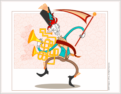
This illustration was made for an ARCHE•BLogGER entry titled, "Tooting Your Own Horn."
The hand drawn, then digitally rendered illustration using Adobe Illustrator, incorporated some inspired influences from both Dr. Seuss and from designer Von Glitschka. The loose "doodled" interpretation of the facial features subtly implied that this article was specifically targeted towards people in the design industry.
©2008 Dagmar Jeffrey. All designs are under their respective copyright. All rights reserved.
Egghead
 Client: Personal
Created exclusively in Illustrator and partially inspired by Spongebob Squarepants and "Merry Melody" styled cartoons, it was originally created as an aid to help a fellow designer who couldn't find examples of highlights, reflections and shadows for him to practice on.
Egghead looked so cute that I thought I'd include him as another example of my illustrative style.
©2008 Dagmar Jeffrey. All designs are under their respective copyright. All rights reserved.
Seapony
 Client: ARCHE•BLogGER
arche-blogger.blogspot.com/2007/01/illustrate-basics.html
What began as a quick side-trip turned into a nifty opportunity to brand my online forum moniker, Seapony. Drawn, scanned, then digitally rendered using Adobe Illustrator CS, the identity-avatar typographically incorporates both the user's surname's initial and the first letter of her forum moniker. The eye colors change depending on the holiday (as with the bottom right version, which depicts Halloween), season, or like an online "mood ring" the general disposition of the user.
The complete history of the evolution of the name and design can be found in the link under the Client name ARCHE•BLogGER, above.
©2008 Dagmar Jeffrey. All designs are under their respective copyright. All rights reserved.
Victorio-Maria logo
 Client: Victorio
The client, a photographer, required a clean, one color identity for his web site and miscellaneous collateral. The striking black and white palette compliments his black and white photographic style, while the 3 color version adds a dash of dramatic color.
For this, a monogram-themed "seal" was developed with the initials of the two names occupying the center along with the five point star, which was of personal significance to the client.
©2008 Dagmar Jeffrey. All designs are under their respective copyright. All rights reserved.
Island Vibes logo
 Client: Island Vibes
This distinctive 2 color identity was for a small travel company that offered tours to the Caribbean Islands.
The client required a clean, simple mark that was affordable to reproduce in mass quantities for a wide range of promotional collateral. For this reason it was decided to employ an exotic "silhouette" with the sun the only color—an eye catching red that would be arresting at any size.
©2008 Dagmar Jeffrey. All designs are under their respective copyright. All rights reserved.
ARCHE•BLogGER Identity
 Client: Archetype Design Studio
Website: www.arche-blogger.blogspot.com
As stated in the tag line, ARCHE•BLogGER is a visual exploration inside the Creative Mind. The web log strives to highlight various travails and points of interest within the creative communication industry.
The identity is a variant of the designer's main identity. It serves not only as a unique entity to represent the blog, it also incorporates the distinct, trademark letter-form image that visually ties it to the parent brand of Archetype Design Studio.
Two identities were developed—one which serves as the blog's main banner and one which serves as the footer. The latter serves as a means to keep the brand in focus when they scroll down beyond the view of the main banner. Creating two different proportions makes the mark versatile enough where it can serve a myriad of promotional uses.
©2008 Dagmar Jeffrey. All designs are under their respective copyright. All rights reserved.
December 04, 2007
Archetype Design Studio Identity
 Client: Archetype Design Studio
Website: www.archetypedesignstudio.com
This is the flagship logo for Archetype Design Studio. Nearly a year in the making, this identity has in fact three unique variations.
A full, brilliant blue four color identity (blue symbolic not only for the "service" industry—ADS offers the service of design–and the designer's favorite color), an "A filled" one color for such uses as invoices and fax transmittal sheets and a black and white "outline" form for watermarks, among other applications.
As with the designer's online web log logo, ARCHE•BLogGER, this logo also has the ability to be altered using color and still maintain an appearance that's characteristic to the overall brand. The uniquely designed A letter is both symbolic and descriptive of the designer's unique typographic and creative style.
The overall mark's style was designed like a unique, identifiable signet, which was and continues to be used to give personal authority in lieu of a signature.
©2008 Dagmar Jeffrey. All designs are under their respective copyright. All rights reserved.
Subscribe to:
Comments (Atom)


